20 Stunning Winter Family Photo Outfits That Will Make Your Holiday Cards Unforgettable
Planning family photos often feels stressful once it’s time to choose outfits, especially when everyone’s clothing has to work together on camera. What seems coordinated in theory can quickly feel overwhelming when standing in front of a closet full of choices.
The added pressure comes from knowing these photos will be shared with friends and family during the holidays. The key to beautiful winter photos isn’t identical outfits, but thoughtful coordination that looks natural, photographs well, and still reflects each person’s personality.
Neutral Tones and Cream Elegance
This look shows how soft neutrals can create a refined and timeless family portrait. Creams and light beiges keep everything visually balanced while allowing each outfit to feel individual rather than overly matched.
Because neutral colors don’t compete with backgrounds or décor, they keep attention on expressions and connection. The overall effect is polished, comfortable, and ideal for holiday cards that won’t feel dated over time.
Elegant Black and White Formal Family Ensemble
A black-and-white palette delivers a clean, classic appearance that always looks intentional. The contrast between light and dark pieces adds structure while keeping the overall look simple.
This color pairing works well in many settings and styles, making it a flexible option for families who want something elegant without relying on seasonal colors.
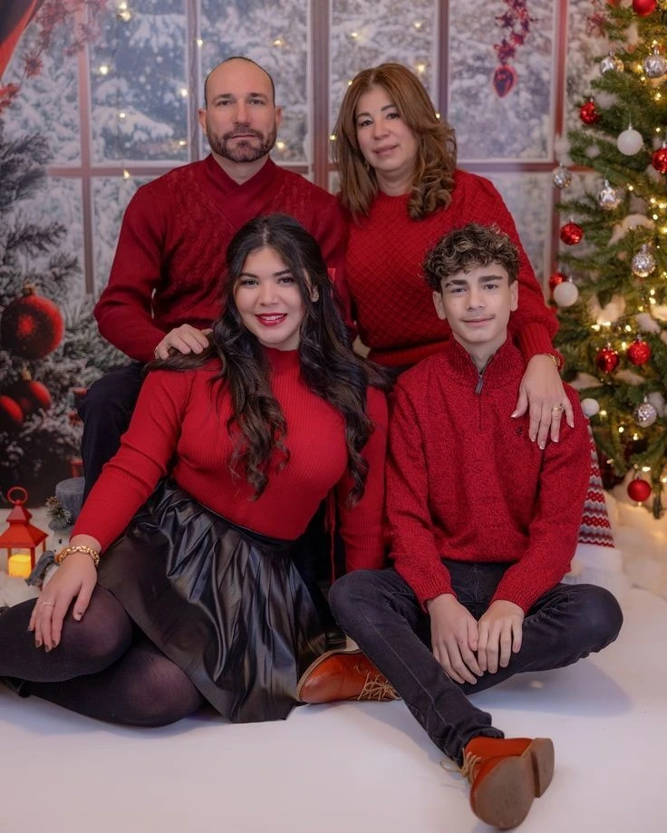
Classic Red and Cream Family Coordination
Rich reds paired with cream tones create a warm and festive feeling without being overwhelming. Each family member’s outfit complements the others while still feeling appropriate for different ages.
The combination feels cozy and refined, making it suitable for holiday cards that aim to look thoughtful and timeless rather than trendy.

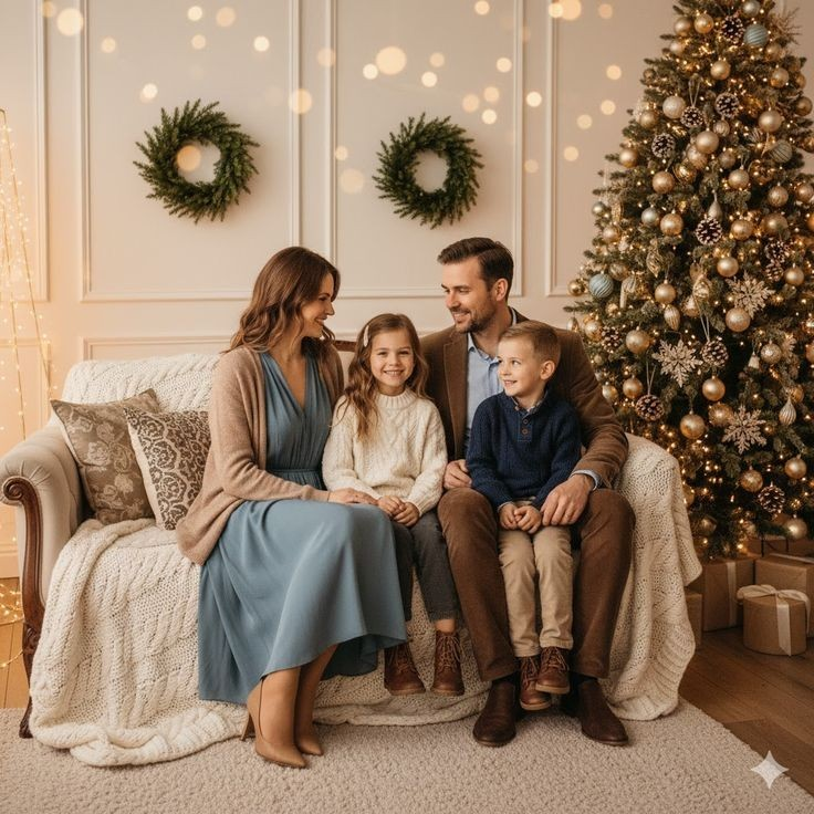
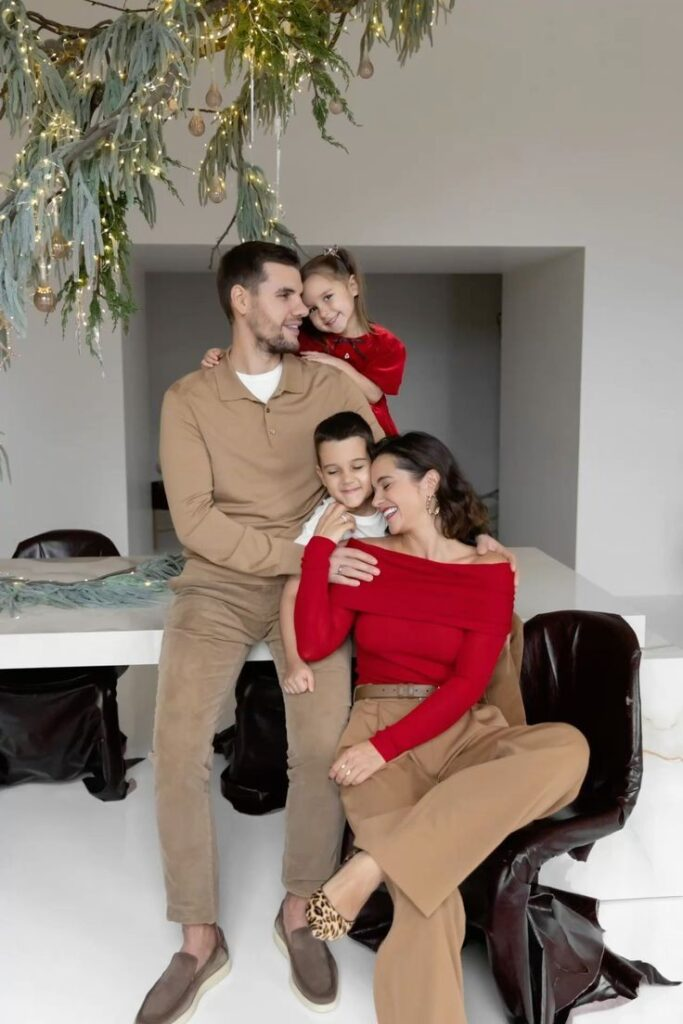
Warm Neutrals with Elegant Layering
Layering neutral shades adds depth while keeping the overall palette calm and unified. Soft textures and varied fabrics help the outfits feel interesting without looking busy.
This approach allows each person to dress comfortably while still contributing to a cohesive family look that works well for holiday portraits.
Cozy Neutral Tones at the Pumpkin Patch
Earthy neutrals fit naturally into outdoor seasonal settings and photograph consistently. The coordinated colors connect well with rustic backdrops while still feeling polished.
This style shows that understated tones can feel just as special as bold colors when thoughtfully combined.

Classic Black and White Elegance
Using black and white keeps the focus on faces and expressions rather than clothing. The simplicity of the palette ensures a balanced and professional appearance.
Because the colors are timeless, this type of outfit choice remains visually appealing long after the season has passed.

Elegant Neutrals with Festive Accents
Soft neutrals paired with subtle festive details create a refined holiday look. Small accents and textures add personality without overpowering the overall coordination.
The result feels elevated and intentional while still maintaining a relaxed family atmosphere.
Classic Red Sweaters with Modern Flair
Different shades and textures of red keep this look interesting without appearing overly uniform. Mixing reds with darker neutral bottoms adds balance.
This approach allows families to use familiar wardrobe pieces while still achieving a cohesive holiday-ready appearance.
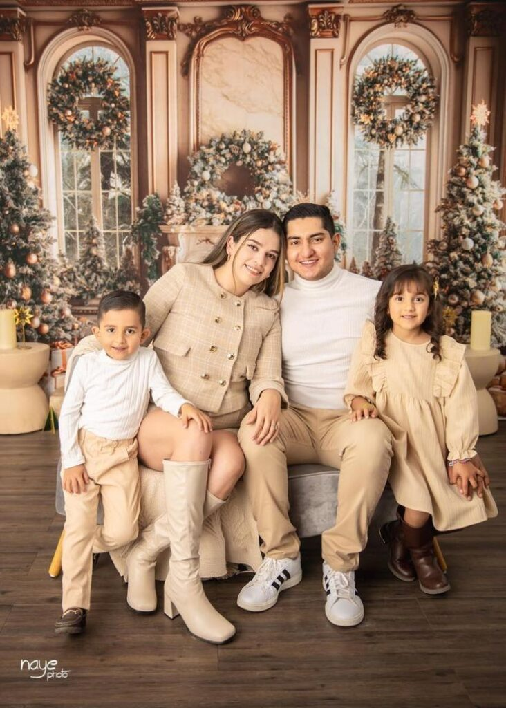
Neutral Tones with Coordinated Elegance
A consistent neutral palette helps unify the family visually while keeping the overall style calm and flattering. Subtle fabric differences prevent the look from feeling flat.
This kind of coordination works well for capturing genuine moments while maintaining a polished final result.

Warm Neutrals with Cozy Knit Textures
Combining soft knits and warm tones creates a welcoming and comfortable look. Texture plays a key role in adding interest while staying within a neutral range.
This outfit style feels natural and relaxed, making it ideal for winter photos that prioritize warmth and togetherness.

Warm Neutrals with Festive Red Accents
Neutral foundations paired with small pops of red introduce holiday spirit without dominating the image. The balance keeps the look modern and visually pleasing.
This approach shows how color accents can enhance a photo while preserving a clean and coordinated aesthetic.
Warm Neutrals with Coordinated Brown Accents
Brown tones layered into neutral outfits create warmth and depth. Each family member’s clothing complements the others without appearing identical.
This style keeps attention on connection and expression while maintaining an effortlessly styled appearance.

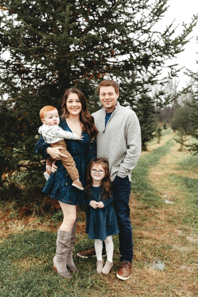
Rich Navy and Neutral Comfort
Deep navy combined with lighter neutrals offers contrast while staying sophisticated. The colors feel seasonally appropriate and photograph well in winter light.
This balance between comfort and structure makes the outfits suitable for relaxed yet polished holiday portraits.
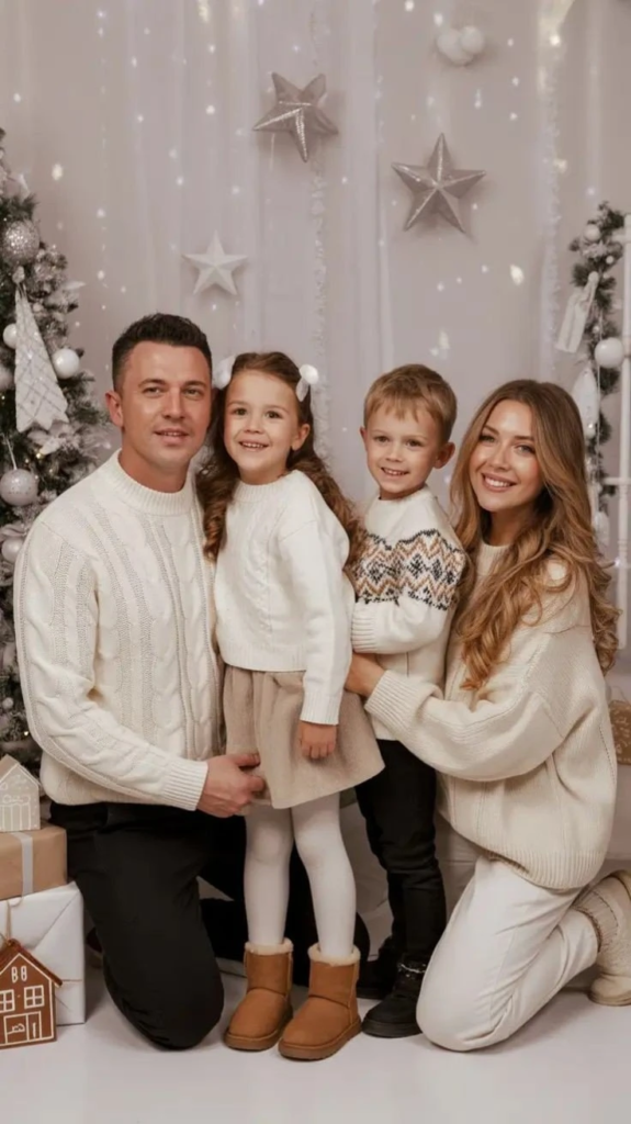
Coordinated Cream and Neutral Knits
Cream and beige knits create a soft, cohesive look that feels calm and inviting. Textured fabrics prevent the outfits from blending together visually.
This coordination style emphasizes closeness and simplicity, which translates well into timeless family photos.
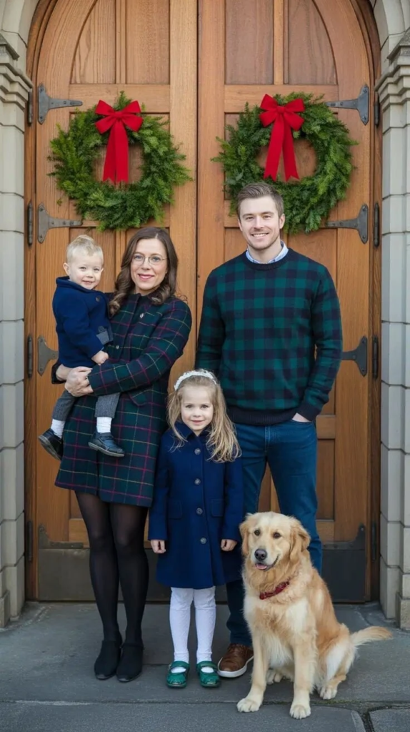
Classic Plaid and Jewel-Tone Elegance
Plaid paired with rich solid colors brings a traditional holiday feel without excess. The mix of patterns and textures keeps the look visually interesting.
This approach feels classic and dependable, making it a strong choice for families who prefer a more traditional style.
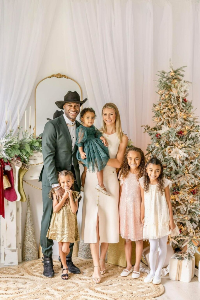
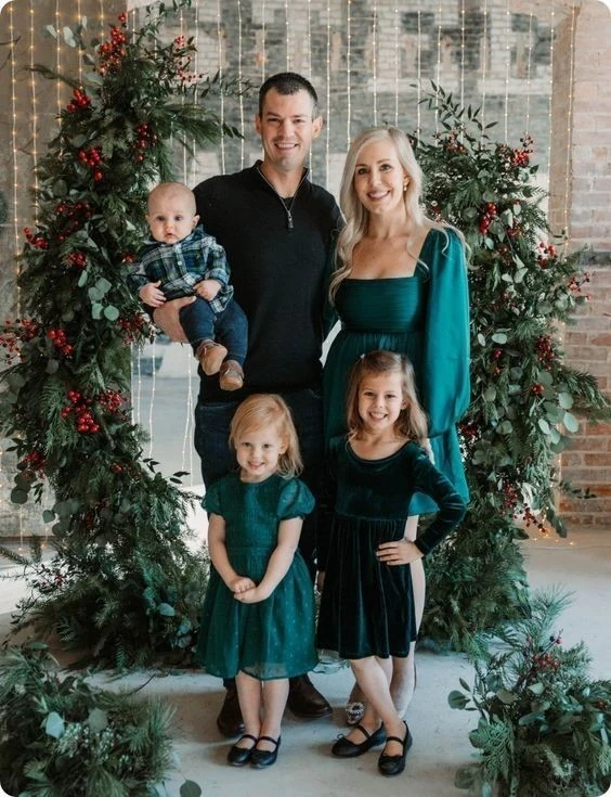
Jewel Tones with Coordinated Family Elegance
Deep jewel shades create a rich, festive mood while maintaining visual harmony. Different silhouettes allow individuality within the shared color theme.
These colors stand out beautifully in winter settings, giving the final photo a refined and intentional appearance.
Elegant Burgundy and Cream Family Palette
Burgundy paired with light neutrals delivers warmth and contrast. Strategic placement of darker tones keeps the palette balanced and polished.
This combination works well for holiday cards that aim to feel elegant without being overly formal.

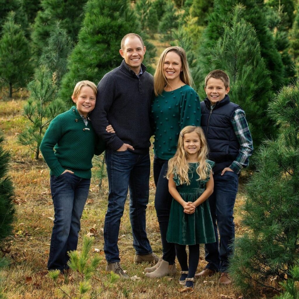
Classic Plaid and Forest Green Coordination
Forest green and plaid create a seasonal look that feels both cozy and classic. Each outfit contributes to the theme without matching exactly.
The result is coordinated and visually rich while still allowing personal style to come through.

Jewel Tones with Navy Accents
Jewel tones mixed with navy create depth and sophistication. The darker base grounds the brighter colors, keeping the overall look balanced.
This palette works especially well outdoors and translates beautifully in both printed and digital photos.
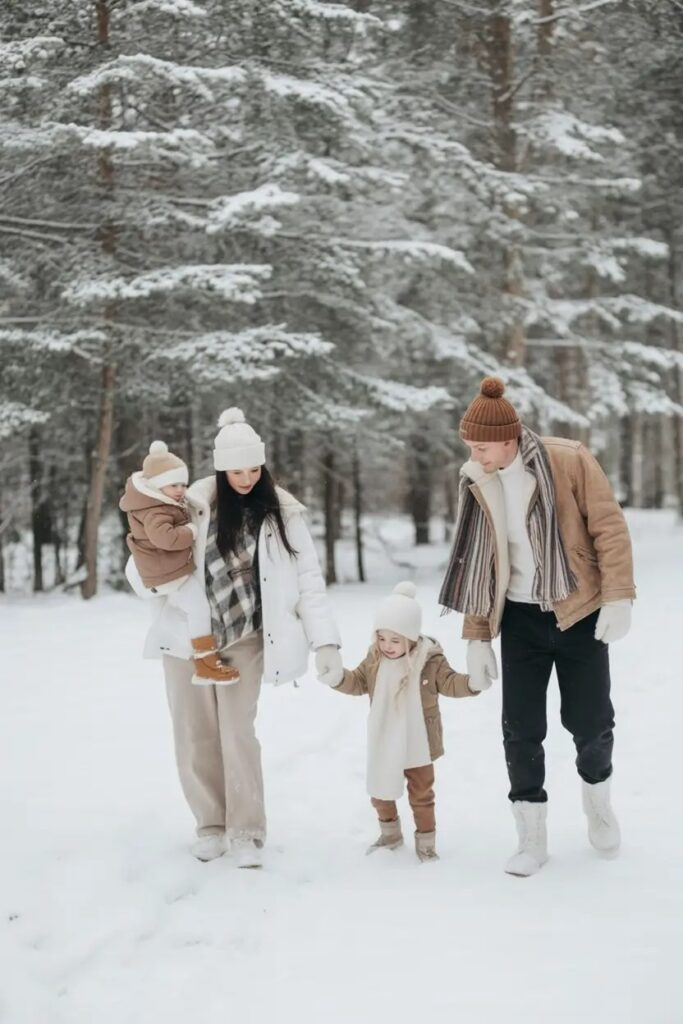
Cozy Neutrals in a Snowy Forest
Soft neutrals paired with winter layers create a cohesive and practical look for cold-weather photos. Texture and layering add interest without relying on bold color.
This style feels authentic and timeless, making it ideal for capturing natural family moments in a winter setting.